Meet Paul Catherall, illustrator of the Modernist Matchbox series
The striking images of the Trellick Tower and the Barbican Estate to begin our new series of Modernist Matchboxes are artworks by Paul Catherall. The London based illustrator and designer captures British Modernist architecture in graphic lines and bold colours. Here he gives us a fascinating insight into this process, influences and commissions.
You were raised in Coventry and the concrete icons of Brutalism and Modernism framed your childhood. Can you describe this experience as a child and any particular memories you have connected to concrete architecture or other buildings?
The influence of my Coventry childhood only came to me later on in life. I think the environment seeped in but it’s not something you’re aware of at the time. I certainly didn’t walk around the city centre stroking my chin admiring the Modernist details and Brutalist stylings – though I definitely remember being drawn to George Wagstaff’s Phoenix sculpture.
I’m sure the wealth of mid century artwork, sculptures and stained glass within the Cathedral had a massive influence – this is something that colours your memories and almost becomes part of you, something that you return to and find comfort in. I was lucky enough to have a happy childhood so maybe those surroundings come through in a positive way.

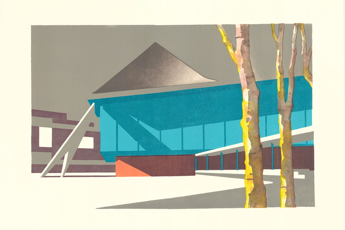
Lloyds III, by Paul Catherall
How do you decide which buildings to capture in your art? Can you tell us a bit about your process, do you research the architecture and architects?
The dramatic angles and dominant shapes of Brutalist buildings lend themselves very well to linocut. I have a long list of structures I want to tackle but I’m also compelled to re-visit certain gems because I tend to get other ideas in the middle of printing a composition. The techniques and process are very much part of creating a print, so new views and textures come to you and they are hard to resist!
In terms of the process I’m quite methodical. I gather as much visual reference as I can – I tend to take lots of photos either in early morning or late afternoon light when the shadows are cast low and form interesting shapes and the definition of the architecture is strong. Then I spend hours, days and sometimes weeks drawing the design on tracing paper, slowly amending and refining – hence the tracing paper. It generally is a case of paring a design down to the essential elements and concentrating on getting a strong composition.
I definitely believe in the mantra of ‘less is more’. When I’m happy with the design I’ll usually do a small colour painted visual. Then when I’m happy with that, I transfer the design onto lino blocks from the tracing paper. From then it’s a case of carving out the lino blocks – I’ll usually start with the main background colour or sky and then move on to the lightest tones through to the darkest.
I mix the inks on a glass surface and ink up the block with a large roller then basically print a number of the first colour. Then the colours are printed one by one – usually with a day or two printing each colour. I sometimes do some research on the architect and the building's history – there’s plenty of good information in two fabulous books – ‘Raw Concrete’ by Barnabas Calder and ‘Concretopia’ by John Grindrod.

Welbeck Blues, by Paul Catherall
After training as an illustrator, you started print-making around 2000, drawn to capturing buildings such as the Millenium Dome and Tate Modern. Some buildings you have captured such as Welbeck Car Park and Elephant & Castle Shopping Centre are now demolished. Why is it important to capture buildings through art?
I just think that Welbeck Street Car Park was a beautiful piece of original architecture that was one of a kind and should have been kept. I wanted to record it, but would have created a print anyway even if it hadn’t been due for demolition. With Elephant & Castle I was always drawn to the place because it reminded me of my childhood home of Coventry. It had seen better days and had basically been left to deteriorate and retained a certain charm.
There are places in Coventry that I definitely wanted to capture as they are due to be destroyed to make way for a new development. The area around the Bull Yard was very much part of my youth and again an original bit of post war building.
Which has been your most exciting commission and brief, can you tell us about it?
I was commissioned by TFL to produce an image of Tate Modern. This was incredibly exciting because it was my first poster commission for TFL. To be part of a rich tradition of poster commissioning was a real thrill and honour. I’d long studied and been influenced by the 20th century artists who’d been commissioned during that era so to be part of that heritage was just wonderful.
A commission from Penguin to illustrate the cover of George Orwell’s ‘Down and Out in Paris and London’ was the most satisfying. The renowned book jacket designer David Pearson directed the brief and set me a challenge of using only three colours, but two overlaid to create a total of four. He also just said he wanted buildings that could possibly be Paris or London – nothing recognisable, but with an overall feeling of chaos. He then actually printed the colours layer by layer – so the commercial printing mirrored the way that I’d printed the linocut.

Paul Catherall
Your style is informed by classic mid century poster design. Please can you tell us more about this influence?
As mentioned above I just love that era of poster design. Many famous artists and renowned designers were commissioned during that period and I think the mix of expert draughtsmanship, strong design and striking colour palettes led to some classic posters. It’s also probably down to that style being around when I was very young and that influence just seeping in subconsciously, similar to the way architecture did.
What colours are you drawn to and why? Do you have a palette of colours you return to? How do you decide which colours to use for which building print or illustration?
I love that colour palette from the 50s and 60s where pinks and blues mixed with earthy autumnal colours. I do have certain combinations that I return to and often place different greys next to brighter colours to enhance them, but also to calm them down. I don’t really know why certain colours come to mind when doing a particular building – they just do. It’s a mix of subconscious and just me thinking about the overall colour of the building and what would contrast with and also enhance it.

Your illustration of Goldfinger's Trellick Tower in London is featured on the first in our series of Modernist matchboxes. Can you tell us about this artwork – what was your first impression of the building, what made it good to depict?
Trellick Tower is a well known depiction of Brutalist architecture. Rather infamous when I first moved to London – but now very desirable and admired by many. I first tackled it in a commission for the London Mayoral elections in 2004. A print from 2015 that depicted the building against textured clouds was also used to grace the cover of ‘King of the City’ by Michael Moorcock published by Orion.
It’s quite tricky to get the angles and composition right as I don’t like to use too much of a wide angle view to squeeze it all in with the iconic service tower. With Trellick Blue IV I wanted to create a design that would retain some of the detail but have a stark, graphic feel that could work if reduced to stamp size. I also decided to have the light source so that the overall silhouette of the building would be strong and in shadow – emphasising its iconic shape. I don’t know why, but I have used blue with the Trellick Tower numerous times. Maybe I wanted to create an optimistic vision that was different from the rather bleak image it had when I first moved to London.
See more of Paul's works at his website: paulcatherall.com

Coventry Central baths, by Paul Catherall
Featuring striking illustrations by Paul Catherall, our Modenrnist Matchboxes collection includes the Barbican Estate and Trellick Tower, with more to come. Designed in London. Made in the EU.

Available from our website here.
1 comment
Like you I grew up in that extraordinary period of poster design and graphic design. And my childhood was not far from Coventry and the amazing architecture and interior decoration of the new cathedral when it was first opened. But we had no idea that it was an amazing and exciting era. It was, as we grew up, just the way things were. It was brilliant. And it is only now that we realise how lucky we were to grow up during a golden age but without seeing it as a golden age. It was just normal. Excitement was commonplace, the right of everyone. Would that it was still so.